App navigation
Main navigation
Choices designers and developers make
In Constellation, it's easy to give users important information, but it can become overwhelming. Use the following suggestions to craft an ideal experience:
- “Choice overload” principles suggest no more than seven main navigation options.
- If more options are needed, use a Landing page as a category, and provide tabs for related content.
- Navigation and Landing page icons and titles should match to assist user wayfinding.
- Show only the most critical Cases in the Create menu. Again, use no more than seven options if possible.
- Disable Notifications, Recents, or global search if they aren’t needed to further reduce "Choice overload”.
What Constellation takes care of
Constellation automatically handles responsivity, and placement of critical options like the Home button, global search, Recents, Notifications, and User management. Additionally, the first navigation option will be set as the Home page of the experience.
Searching for data
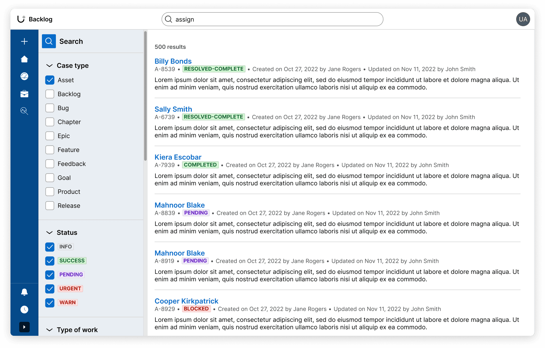
Users can search for content within your application using the global search function in the main navigation or application header. Users will then land on the search results page, where they can find or filter their search results.
Users can also search and filter list types in nearly every part of the UI by using the toolbar.
Configuration
To learn how to configure navigation options in your Constellation application, visit Pega Documentation.
Related components
While Constellation components can’t be placed wherever in the UI via authoring, knowing how they work in these patterns can help you understand our center-out design practices.