Table
Tables hold sets of related data and allow users to review, search, filter, and organize this data to gather insights and make informed decisions.
Usage
A table is the primary component used to present large sets of related data. Other components, such as the summary list and timeline list components, should only be used for presenting compact or time-based data.
While most people call these "tables", they are using the semantic role of grid for accessibility reasons. Tables can be fully navigated using a keyboard.
Anatomy
Tables consist of the following regions: table header, table toolbar, column headings, and rows.
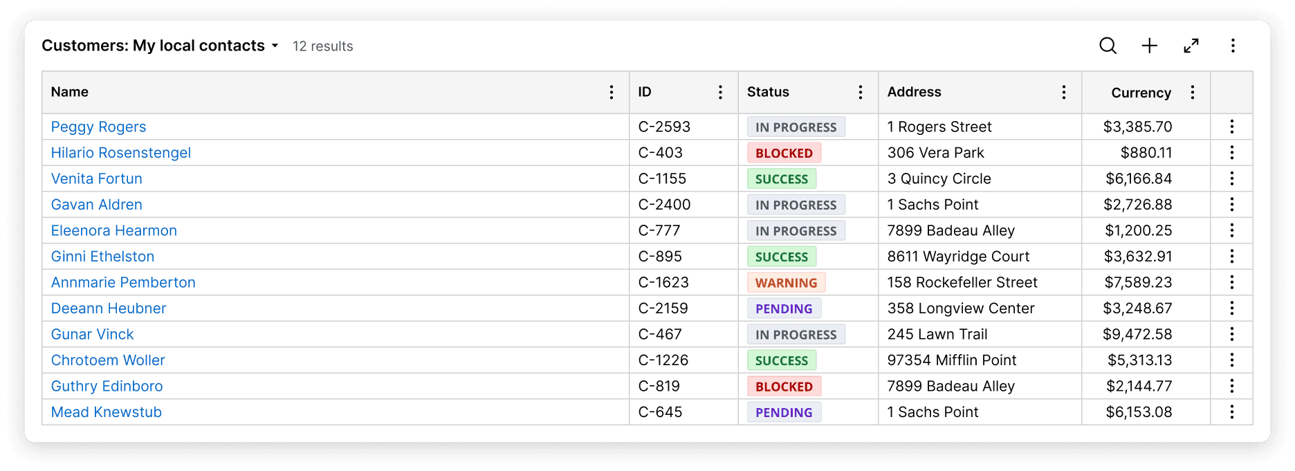
Table header
The table header displays the table name. Here, end users can switch to presets provided by citizen developers.
Table toolbar
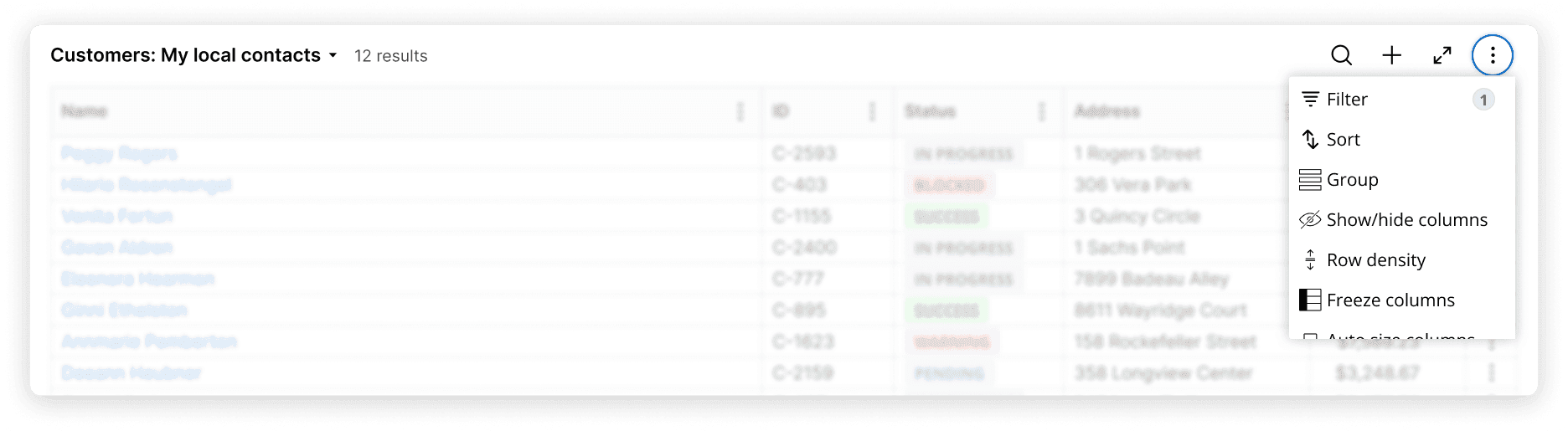
The table toolbar provides common actions a user can take to curate table data. These include:
- Search across all table data
- Filter data by column or across all columns
- Sort data by column or across all columns
- Group data to present related information together
- Auto-resize and reset column width
- Hide columns
- Adjust row density to increase or decrease row height
- Save table customizations
Column headings
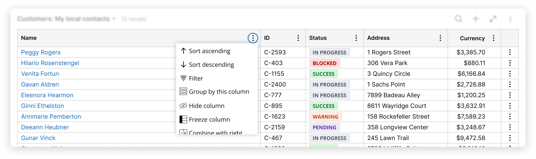
Column headings provide context for the rows below a column heading and provide column-level actions. These actions include:
- Filter data within a column
- Sort data within a column
- Group data within a column to present related information together
- Hide a column
- Combine columns for easier review. For example, you can merge “first name” and “last name” columns to make one “full name” column
- Freeze a column to always keep key data in view
- Resize a column heading based on the content within the loaded rows of content in that column. It is also possible to reset column widths to their default.
Of note, a column's width is determined first by a user's preference, then by authored settings, and finally by the content within the rows themselves.
Column widths do not update when scrolling or loading additional rows of content, even if that content is wider than the column's initial width. This prevents visual thrashing, loss of user orientation, and performance issues. They may change however on a reload of the page.
Rows
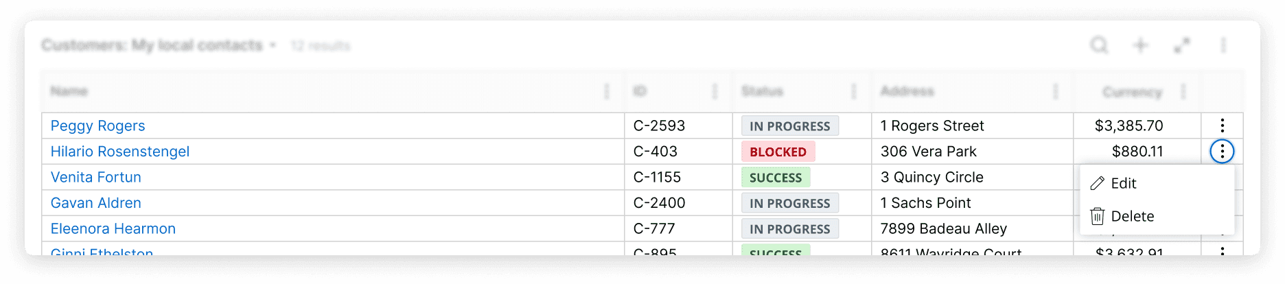
Rows hold table data. They can be organized to display large sets of data in a way that is easy to understand. Rows also offer the ability to edit content for a row item.
Configuration
To configure this component in your Constellation application, visit Pega Documentation.
All information on this site pertains to the Constellation UX System (from 8.8 and onwards). Looking for something else? See resources specifically for Theme Cosmos. If you have questions, concerns, or any other feedback, please reach to us on Pega Support and include the capability 'User Experience' and 'Constellation' in your request.
Related components
Empty state
Summary list