The rich text editor can collect styled free-form text and images from the user.
Usage
Rich text editor is used within a form when styled text, links, and imagery need to be collected, as opposed to plain text collected by the text area component. It also can be used for document and note creation/editing.
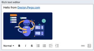
The rich text type will render the full rich text editor and its toolbar, which allows you to customize text areas with:
- Heading styles
- Bold
- Italics
- Strikethrough
- Bulleted and numbered lists
- Indent formats
- Images
- Hyperlinked text
For best practices on building forms with inputs in the design system, visit Pega Academy.
Configuration
To learn how to configure this component in a Pega application, visit Pega Documentation.
All information on this site is for Pega’s UX design system, also known as Constellation (from 8.8 and onwards). If you have questions, concerns, or any other feedback, please reach to us on Pega Support and include the capability ‘User Experience’ and ‘Constellation’ in your request.
Related components