Users conduct work in the UX design system by creating and managing Cases. A Case is a work item that users complete to achieve an outcome, such as processing an insurance claim. Users complete Assignments to progress through a case’s Lifecycle and complete a case.
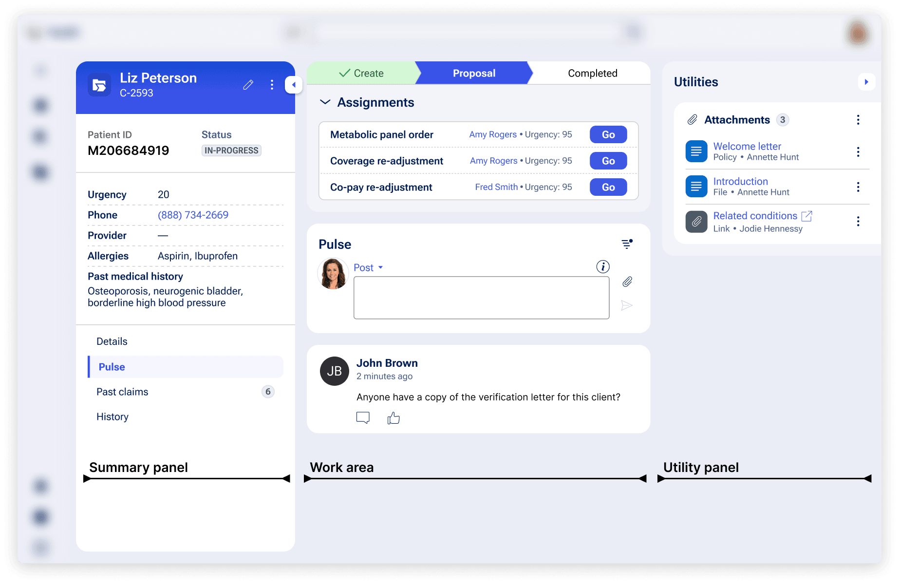
Once a case is created, users manage work on that case using the Case page. Here, they will follow a prescribed workflow to conduct work, using the following three regions on the page:
- The Summary panel displays an overview of the most important data and contains the case’s primary tabs
- The Work area is where most of the case activity occurs and users get work done. The work area may consist of Assignments, Pulse, and other components used to conduct work
- The Utilities panel contains relevant attachments, team info, and other critical tools
Additionally, Data Objects also use this layout, but without workflows elements like Assignments.
How they are structured in the design system
Summary panel
Users will use the summary panel to quickly and conveniently access the most important information about a case when completing work— like the Case ID, status, and account details.
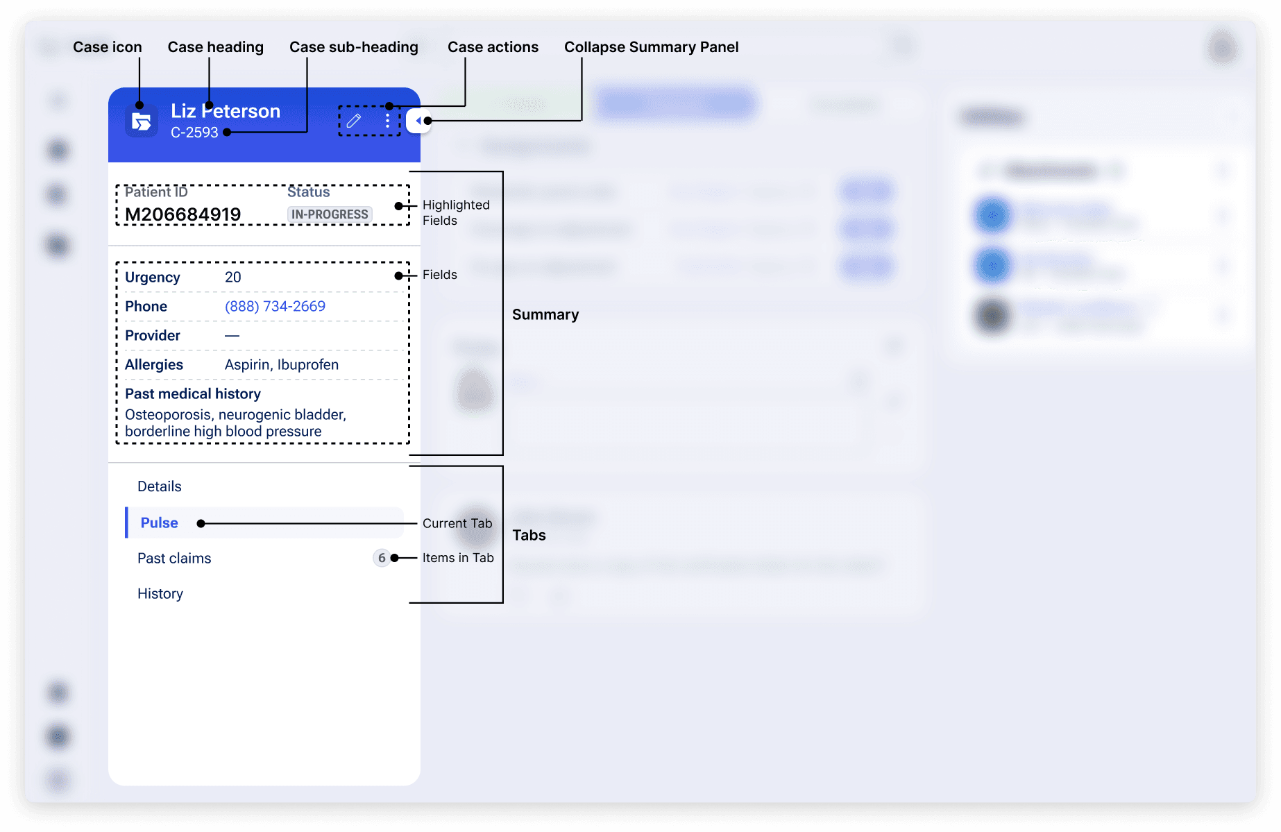
The summary panel is made up of the following elements:
The case header is used to convey the most important information about the case, at a glance. It includes the following information:
- The Case type’s icon
- The Case’s label
- Its unique ID
- Actions menu
The highlighted fields and fields show the data required to understand the case or piece of work quickly and across all contexts. These fields may include:
- A list of generic or topical updates (e.g., last updated, status, etc.)
- Core information unique to the case or work (i.e., if you are creating a medical insurance application – a member filing claim, specific injury, etc.)
The designer may decide the order of items and total number of items shown. We recommend including no more than seven items to avoid a busy UI.
Tabs house critical pieces of data that allow users to complete their work. Examples include:
- The Pulse tab, which includes full chat conversations and important milestones in the case (and may add details or context in a way that standard data fields cannot)
- The details tab, which includes additional information that is not already provided in the summary
- Custom tabs, which are generally reserved for several types of data:
- Child cases – used to reveal a full list of dependencies, children, and other relationships between data. These are typically used for robust lists of data that must be displayed in entirety or in tables (for comparison)
- Insights – used to visualize data that reveals trends
Additionally, users can collapse the summary panel to hide it from view at any point in the workflow. This allows them to control their view of the Case Page, including what information is displayed and how screen space is used. When expanded again, the summary panel will display as the user last left it.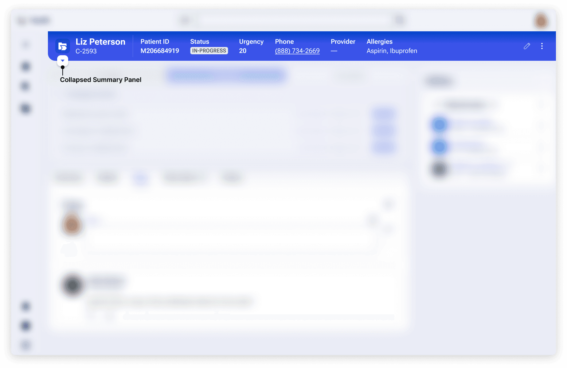
Work area
The work area is where users complete their work on a case. This is where users will complete Assignments and progress through the Stages of a case until completion.
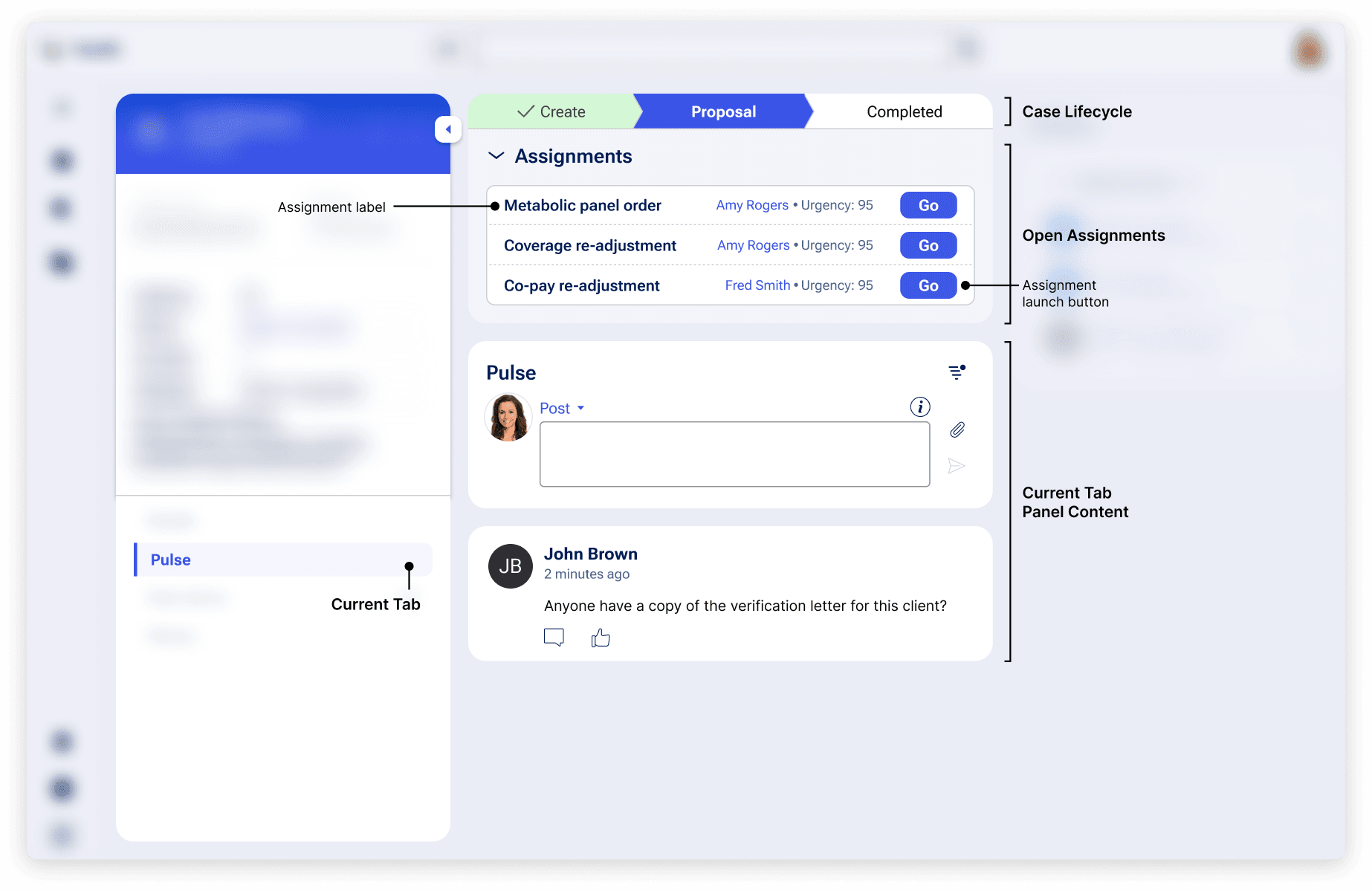
The work area is made up of the following elements:
- The Lifecycle of a Case, also known as Stages, shows the past, present and future state of the workflow. Users can reference this component to understand what has already been completed on a case and what is upcoming.
- Assignments which include the work-to-be done items. Users will work through Assignments to complete case Stages and move work forward until a case is completed. Assignments are made up of forms.
- Panel with current tab details, which displays the selected summary panel tab’s information. This content can include case details, the Pulse feed, or lists of cases
Utilities panel
The Utilities panel is a collapsible region where users access relevant documents and information on people and other cases related to a case.
Like the Summary panel, users can collapse the Utilities panel to hide it from view at any point in the workflow. When expanded again, the Utilities panel will display as the user last left it.
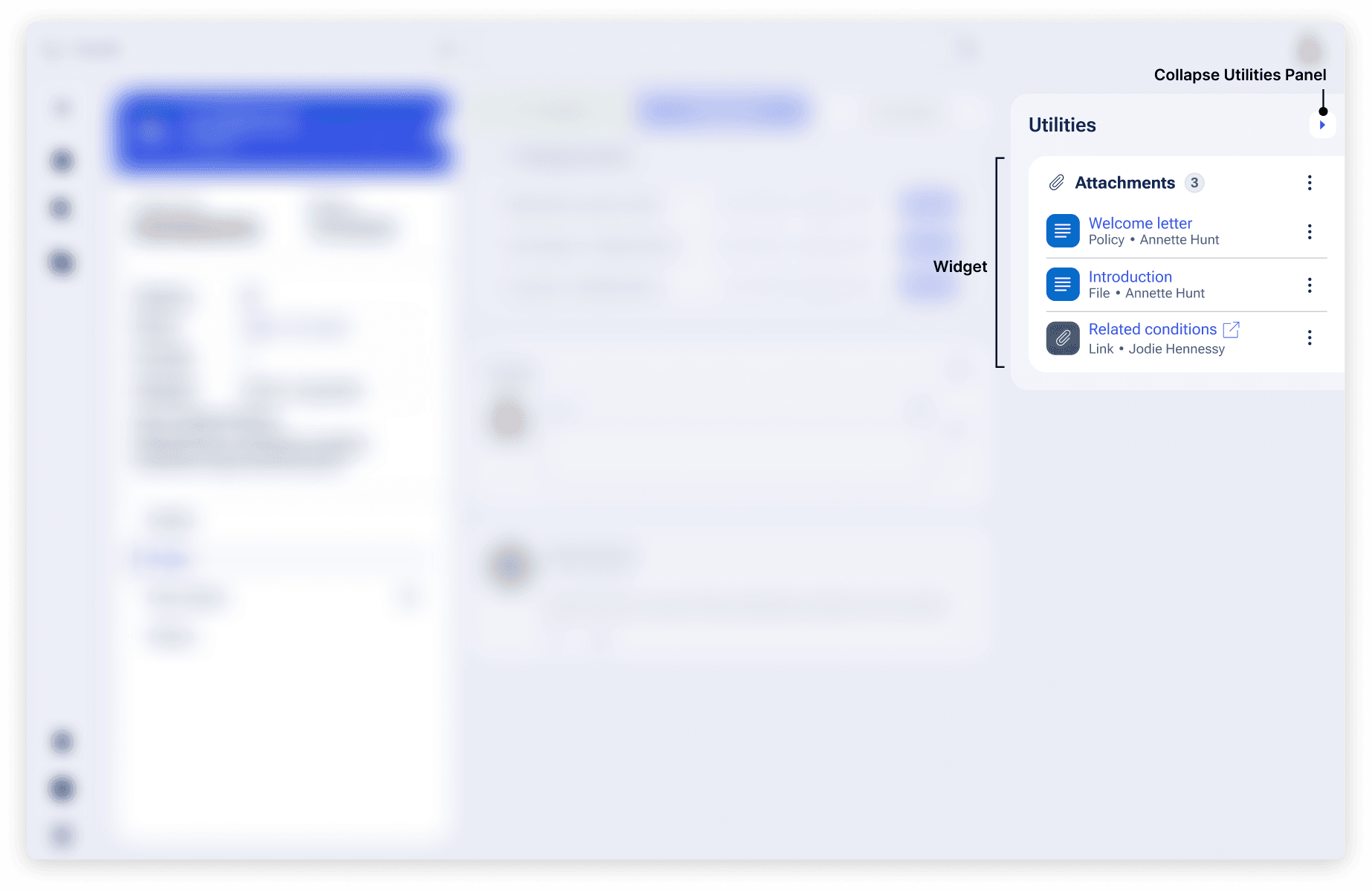
The Utilities panel can show the following widgets – small ad-hoc content that may or may not be relevant to the flow of a case:
Utilities are an optional part of a Case; if there are none configured, this panel will not be shown.
What the design system takes care of
While Cases and Data Objects provide a large amount of configuration flexibility, there are some items the design system will handle automatically.
- Creation: Instead of navigating to a form on a new page, users create within a modal. This “Create Modal” lets users keep context of background work and easily gather supporting information from around the UI by minimizing the modal.
- Readable widths: Form elements, layouts and text within regions won’t exceed 80 characters to help low vision users (WCAG 2.3 1.4.8).
- Consistency: Manages locations of the three key areas of Summary, Assignments, tab content, and Utilities. In the Summary panel, headings, icon and action placements, summary details, and tab locations are managed also to provide consistency between pieces of work. Cards and modals have a consistent look and placement of headings and actions.
- Responsivity: Content will reflow on various device sizes. Configured layout templates are recommendations that are used when space allows.
Configuration
To learn how to configure Cases and Data Objects in your Pega application, visit Pega Documentation.
Related components
While components can’t be placed wherever in the UI via authoring, knowing how they work in these patterns can help you understand our center-out design practices.
General
Widgets