Badges are compact visual clues that highlight key details on items or objects. Examples of highlighted information include statuses, total items within a group, or categories of related content.
Variations
Counter
Counter badges give a summary of how many items are within an asset, attributed to an action, or need attention. Counter badges appear on utility widgets. This is a non-interactive badge.
Status
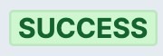
Status badges and their colors help users quickly find a case or object’s health. Status badges are used only for objects and cases.
Color alone must not convey meaning according to international accessibility guidelines. The label in the badge itself must also clearly identify the status. This is a non-interactive badge.
Selectable
Selectable badges are often found in multi-select field inputs or stacks of applied filters on a table.
Tag
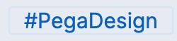
Tag badges reveal user-created tags associated to a case, object, or post. Tags may be either interactive or static. The hash symbol is common on tags, but not required.
Keyboard
Keyboard badges indicate which keyboard commands are available to a user to perform a particular action.
Configuration
All information on this site is for Pega’s UX design system, also known as Constellation (from 8.8 and onwards). If you have questions, concerns, or any other feedback, please reach to us on Pega Support and include the capability ‘User Experience’ and ‘Constellation’ in your request.
Related components