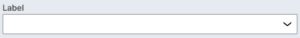
Select and combobox inputs provide a set of options for the user to select from.
Usage
Use a Combobox or Select field in a form if you have 3 or more options to display, or if the options are dynamic. If there are fewer than 3 options, use a radio button group or checkbox group.
In most cases, use the Combobox as the default for displaying more than 3 options. The Combobox input allows the user to select multiple options and search for options. However, if the desire is to use a native picker on a mobile device, Select may be the better choice.
For best practices on building forms with inputs in the design system, visit the Forms page under Patterns.
Configuration
To learn how to configure this component in a Pega application, visit Pega Documentation.
All information on this site is for Pega’s UX design system, also known as Constellation (from 8.8 and onwards). If you have questions, concerns, or any other feedback, please reach to us on Pega Support and include the capability ‘User Experience’ and ‘Constellation’ in your request.
Related components