Banners notify users when something important happens in the current case or flow, or when a user action is requested. Banners present three types of content: warnings, information, and critical issues.
Usage
The banner component is displayed at the top of the region the banner is addressing. The location is not configurable.
Variations
Urgent banners
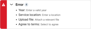
Urgent banners show messages that the user must instantly be aware of in order to move forward or to prevent data loss. Examples include server errors, reboot timers, or a summary of form errors. These banners should never be dismissible.
Warning banners
Warning banners show non-blocking issues that may have serious consequences if ignored. They are often non-dismissible. Examples include legal considerations and reminders about expirations.
Information banners
Information banners show useful things such as tips, help, or context. They are often dismiss-able and do not use the multi-line pattern often.
Content guidelines
- Banners do not allow configurable text, but are generated by the system.
- Content within banners should end in a period.
- Banners will either be a single line of text or stack messages when two or message of the same type appear. Examples include when a few uploads fail, or when more than one form field has an error.
- Only one banner per section should appear.
Configuration
This component is non-configurable.
All information on this site is for Pega’s UX design system, also known as Constellation (from 8.8 and onwards). If you have questions, concerns, or any other feedback, please reach to us on Pega Support and include the capability ‘User Experience’ and ‘Constellation’ in your request.
Related components