Modal dialogs, also known as modals, communicate information using an overlaid window that allows users to remain within the context of their workflow, but demands their attention.
Usage
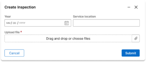
Modals are used for creating, editing, and completing local actions. Modals are also named by the action that launched them. (e.g. “Delete” button opens the “Delete {itemname}” modal)
Modals allow users to remain within the context of their work. For example, a user may need to create a new case related to the one they are currently viewing. They may be minimized and “docked” to the bottom of the screen, allowing users to review or copy other application content directly into the modal while they work.
Modals can be closed via the escape key, a Cancel button, or by clicking the backdrop outside of the modal.
In the UX desgin system, modals may increase in size to fit wider content within. Additionally, modals are affixed to the top of the screen, so if content is conditionally shown as users work, the vertical position of the modal does not shift vertically. This saves users from re-orienting their view.
Variations
Confirm dialog
Confirm dialogs are displayed when users take an action that will result in a significant change, such as loss of data. For example, a confirm dialog can display when a user tries to leave a form that has unsaved changes.
Minimizable modal
Modals can be minimized to be re-opened at any point in the creation procss. When minimized, the modal will appear in the bottom right of the viewport. From here, the modal can either be closed, or re-opened by clicking on the header.
Configuration
No configuration is needed for this component in the design system.
All information on this site is for Pega’s UX design system, also known as Constellation (from 8.8 and onwards). If you have questions, concerns, or any other feedback, please reach to us on Pega Support and include the capability ‘User Experience’ and ‘Constellation’ in your request.