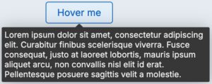
The Tooltip component shows additional information, tips, or hints related to a specific piece of interactive UI. Tooltips are activated when the user hovers over or focuses on the interactive element or icon button. They do not include actions or links.
Usage
Use Tooltips for items with no visible label, or when a label is too long. Tooltips themselves are not focusable, but they launch from a hover or focus event on an interactive item. Occasionally, some items will be interactive exclusively in order to reveal the otherwise hidden content within a Tooltip.
When using a Tooltip, avoid overly vague descriptions. The Tooltip should inform the user of exactly what action will happen if the item is activated. For example, instead of “Edit,” the Tooltip should read “Edit application”.
Configuration
All information on this site is for Pega’s UX design system, also known as Constellation (from 8.8 and onwards). If you have questions, concerns, or any other feedback, please reach to us on Pega Support and include the capability ‘User Experience’ and ‘Constellation’ in your request.
Related components