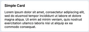
Cards represent a complete collection of information about an object. They are used to visually group blocks of content or interactions together.
Anatomy
A card consists of three sections: a header, body, and footer.
A card header always has a title and can have imagery and actions. The title and optional imagery are located on the left, while the actions are located on the right side of the card header.
The card body accommodates any layout or design of related information. In modals, follow typography guidelines. In cards with editable content, follow guidelines for text input fields and form design. The body section allows for flexibility in design depending on the content needed to display to the user.
A card footer can optionally include primary and secondary buttons to progress a user through intended actions.
Configuration
Cards are the default content container for much of the application experience, and are often configured within Views. To learn how to configure Views in the design system, visit Pega Documentation.
All information on this site is for Pega’s UX design system, also known as Constellation (from 8.8 and onwards). If you have questions, concerns, or any other feedback, please reach to us on Pega Support and include the capability ‘User Experience’ and ‘Constellation’ in your request.