Date and time inputs allow a user to enter a specific date, time, or date and time.
Variations
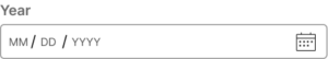
Date input
The date input component allows a user to enter a specific date via the text field. The text field automatically ensures the date follows the set format. This component is also capable of opening a calendar for the user to select a date without typing it in.
Usage
There are a variety of date and time inputs designed to support any of the date and time inputs your application may need. All components are designed to be flexible within whatever locale they are used in.
For best practices on building forms with inputs in the design system, visit the Forms page under Patterns.
Time input
The time input provides a text field where users may enter the time following the specified format. By default, the user is expected to enter hours and minutes, but can also be required to enter seconds.
The en-US locale also provides the user with a dropdown to select AM or PM.
This component may open a time picker with predefined intervals to select a time without typing it in.
Time picker
The time picker component can be used when a user may want to quickly select the time from predefined options. By default, the options interval is set to 30 minutes, but this may be changed.
This component supports locale to control 12/24h clock format.
Date and time input
The date and time input is a combination of the date input and time input.
Configuration
To learn how to configure this component in a Pega application, visit Pega Documentation.
All information on this site is for Pega’s UX design system, also known as Constellation (from 8.8 and onwards). If you have questions, concerns, or any other feedback, please reach to us on Pega Support and include the capability ‘User Experience’ and ‘Constellation’ in your request.
Related components